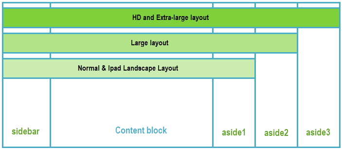
For example, in HD and Extra large layout, it has 4 module positions: sidebar, aside1, aside2, aside3. But in the Large layout, it has only 3 module positions, the aside3module position is disabled in the layout.
Size of the module position also changes due to screen size (responsive).
In mobile and iPad Portrait layout, modules in position: aside1, aside2, aside3 are displayed under the content block.
https://ketokollection.com/index.php/min/module-position#sigProGalleriac63048fbd3
Note: The module positions are not displayed in the following cases:
1. Joomla: Menu type = Category Blog
2. K2 category template = ja_wall


