https://ketokollection.com/index.php/blackb/base-grid-and-layout#sigProGalleria6164656daa
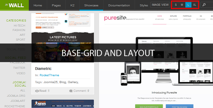
Item size in each view size is defined differently. In the layout.css file, the basegrid in each view is defined as following:
{codecitation}/* MASONRY PRESETS
--------------------------------------------------------- */
/* Percentage width reference:
- 100% ~ 1 col
- 50% ~ 2 cols
- 33.3% ~ 3 cols
- 25% ~ 4 cols
- 20% ~ 5 cols
- 16.6% ~ 6 cols
- 14.2% ~ 7 cols
- 12.5% ~ 8 cols
- 11.1% ~ 9 cols
- 10% ~ 10 cols
*/
/* Default (Medium) ----*/
.item {
display: block;
float: left;
width: 25%; /* 4 cols */
max-width: 100%
}
.item .item-inner {
margin: 5px;
padding: 0;
}
.grid-double {
width: 50%;
}
.grid-triple {
width: 75%;
}
/* Small ---*/
body.basegrid-s .item {
width: 20%; /* 5 cols */
}
body.basegrid-s .grid-double {
width: 40%;
}
body.basegrid-s .grid-triple {
width: 60%;
}
/* Large ---*/
body.basegrid-l .item {
width: 33.3%; /* 3 cols */
}
body.basegrid-l .grid-double {
width: 66.6%;
}
body.basegrid-l .grid-triple {
width: 100%;
}
/* X-Large ---*/
body.basegrid-xl .item {
width: 50%; /* 2 cols */
}
body.basegrid-xl .grid-double,
body.basegrid-xl .grid-triple {
width: 100%; /* No triple grid on X-Large */
}{/codecitation}
- Small: width size of 1 default item = 1 grid, 1 grid = 20% total width of the layout (100%). Grid-double = 40% and grid-triple = 60%.
- Medium: width size of 1 default item = 1 grid, 1 grid = 25% total width of the layout (100%). Grid-double = 50% and grid-triple = 75%.
- Large: width size of 1 default item = 1 grid, 1 grid = 33.3% total width of the layout (100%). Grid-double = 66.6% and grid-triple = 100%.
- Extra Large: width size of 1 default item = 1 grid, 1 grid = 50% total width of the layout (100%). Grid-double = 100%, no triple grid in this view size
Note: The settings in the layout.css file are the default settings, they will be overridden by css file of specific layouts due to user's screen size.
2. Block View
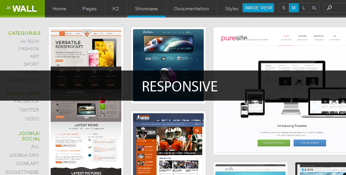
JA Wall Template supports 2 block views (only for ja_wall template, ja_wall_blog does not support these block views): Full view and Image view. Full view will display items with images, and descriptions while the Image View only displays images, so if items have no image, they are not displayed.
You can set a specific block view for a menu in the menu settings panel.
https://ketokollection.com/index.php/blackb/base-grid-and-layout#sigProGalleriaa60af34039
3. Pop-up
JA Wall Template supports pop-up view for items (only for ja_wall template, ja_wall_blog does not support these block views):
You can enable the pop-up view option for specific menus from the menu settings panel.
https://ketokollection.com/index.php/blackb/base-grid-and-layout#sigProGalleria7ddab2a10d
II. Layout
There are 6 layouts defined in the template: HD-layout, Extra-wide, wide, normal, tablet and mobile. And they are defined in the your_site/templates/ja_wall/index.php file.
https://ketokollection.com/index.php/blackb/base-grid-and-layout#sigProGalleriae4f38c303b
{codecitation}
<!-- MEDIA QUERIES -->
<link rel="stylesheet" type="text/css" href="/<?php echo $this->baseurl ?>/templates/<?php echo $this->template; ?>/css/layout-mobile.css" media="only screen and (max-width:719px)" />
<link rel="stylesheet" type="text/css" href="/<?php echo $this->baseurl ?>/templates/<?php echo $this->template; ?>/css/layout-mobile-portrait.css" media="only screen and (max-width:479px)" />
<link rel="stylesheet" type="text/css" href="/<?php echo $this->baseurl ?>/templates/<?php echo $this->template; ?>/css/layout-tablet.css" media="only screen and (min-width:720px) and (max-width: 985px)" />
<link rel="stylesheet" type="text/css" href="/<?php echo $this->baseurl ?>/templates/<?php echo $this->template; ?>/css/layout-normal.css" media="only screen and (min-width:986px) and (max-width: 1235px)" />
<link rel="stylesheet" type="text/css" href="/<?php echo $this->baseurl ?>/templates/<?php echo $this->template; ?>/css/layout-wide.css" media="only screen and (min-width:1236px) and (max-width: 1585px)" />
<link rel="stylesheet" type="text/css" href="/<?php echo $this->baseurl ?>/templates/<?php echo $this->template; ?>/css/layout-wide-extra.css" media="only screen and (min-width:1586px) and (max-width: 1890px)" />
<link rel="stylesheet" type="text/css" href="/<?php echo $this->baseurl ?>/templates/<?php echo $this->template; ?>/css/layout-hd.css" media="only screen and (min-width:1891px)" />
<!-- //MEDIA QUERIES -->{/codecitation}
-
The HD layout has minimum width = 1901 pixel
-
The Extra wide layout has minimum width = 1586 and maximum = 1900 pixel
-
The wide layout has minimum width = 1236 and maximum = 1585 pixel
-
The Normal layout has minimum width = 986 and maximum = 1235 pixel
-
The wide layout has minimum width = 720 and maximum = 985 pixel
-
The Mobile Portrait layout has maximum width = 479 pixel
-
The Mobile Landscape layout has maximum width = 719 pixel
https://ketokollection.com/index.php/blackb/base-grid-and-layout#sigProGalleria8ecdcf7234
Note: These files will override layout.css file. For example: when user displays the template on screen, screen size = 1900 pixel --> Extra layout --> then the file: layout-wide-extra.css overrides the layout.css file.
2.1 HD-Layout
When user's screen size > 1900 pixel, the template uses layout-hd.css as the style file

{codecitation}/* Default (Medium) ----*/
.item {
width: 14.2%; /* 7 cols */
}
.grid-double {
width: 28.4%;
}
.grid-triple {
width: 42.6%;
}
/* Small ---*/
body.basegrid-s .item {
width: 12.5%; /* 8 cols */
}
body.basegrid-s .grid-double {
width: 25%;
}
body.basegrid-s .grid-triple {
width: 37.5%;
}
/* Large ---*/
body.basegrid-l .item {
width: 16.6%; /* 6 cols */
}
body.basegrid-l .grid-double {
width: 33.3%;
}
body.basegrid-l .grid-triple {
width: 49.8%;
}
/* X-Large ---*/
body.basegrid-xl .item {
width: 20%; /* 5 cols */
}
body.basegrid-xl .grid-double {
width: 40%;
}
body.basegrid-xl .grid-triple {
width: 60%;
}
{/codecitation}
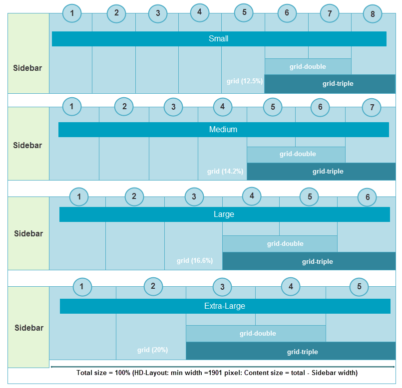
- Small (8 columns): width size of 1 default item = 1 grid, 1 grid = 12.5% total width of the layout (100%). Grid-double = 25% and grid-triple = 37.5%.
- Medium (7 columns): 1 grid = 14.2%, grid-double = 28.4% and grid-triple = 42.6%.
- Large(6 columns): 1 grid = 16.6%, grid-double = 33.3% and grid-triple = 49.8%.
- Extra Large(5 columns): 1 grid = 20%, grid-double = 40% and grid-triple = 60%.
https://ketokollection.com/index.php/blackb/base-grid-and-layout#sigProGalleria6aa340e51a
2.2 Extra Wide Layout
When user's screen size =< 1901pixel and >= 1586 pixel, the template uses layout-wide-extra.css as the style file
{codecitation}/* Default (Medium) ----*/
.item {
width: 16.6%; /* 6 cols */
}
.grid-double {
width: 33.2%;
}
.grid-triple {
width: 49.8%;
}
/* Small ---*/
body.basegrid-s .item {
width: 14.2%; /* 7 cols */
}
body.basegrid-s .grid-double {
width: 28.4%;
}
body.basegrid-s .grid-triple {
width: 42.6%;
}
/* Large ---*/
body.basegrid-l .item {
width: 20%; /* 5 cols */
}
body.basegrid-l .grid-double {
width: 40%;
}
body.basegrid-l .grid-triple {
width: 60%;
}
/* X-Large ---*/
body.basegrid-xl .item {
width: 25%; /* 4 cols */
}
body.basegrid-xl .grid-double {
width: 50%;
}
body.basegrid-xl .grid-triple {
width: 75%;
}
{/codecitation}
- Small (7 columns): width size of 1 default item = 1 grid, 1 grid = 14.2%. Grid-double = 28.4%; and grid-triple = 42.6%.
- Medium (6 columns): 1 grid = 16.6%;, grid-double = 33.2% and grid-triple = 49.8%.
- Large(5 columns): 1 grid = 20%, grid-double = 40% and grid-triple = 60%.
- Extra Large(4 columns): 1 grid = 25%, grid-double = 50% and grid-triple = 75%.
https://ketokollection.com/index.php/blackb/base-grid-and-layout#sigProGalleriaeb99f7daa2
2.3 Wide Layout
When user's screen size =< 1585 pixel and >= 1236 pixel, the template uses layout-wide.css as the style file
{codecitation}/* Default (Medium) ----*/
.item {
width: 20%; /* 5 cols */
}
.grid-double {
width: 40%;
}
.grid-triple {
width: 60%;
}
/* Small ---*/
body.basegrid-s .item {
width: 16.6%; /* 6 cols */
}
body.basegrid-s .grid-double {
width: 33.2%;
}
body.basegrid-s .grid-triple {
width: 49.8%;
}
/* Small ---*/
body.basegrid-l .item {
width: 25%; /* 4 cols */
}
body.basegrid-l .grid-double {
width: 50%;
}
body.basegrid-l .grid-triple {
width: 75%;
}
/* X-Large ---*/
body.basegrid-xl .item {
width: 33.3%; /* 3 cols */
}
body.basegrid-xl .grid-double {
width: 66.6%;
}
body.basegrid-xl .grid-triple {
width: 100%;
}{/codecitation}
- Small (6 columns): width size of 1 default item = 1 grid, 1 grid = 16.6%. Grid-double = 33.2%; and grid-triple = 49.8%.
- Medium (5 columns): 1 grid = 20%;, grid-double = 40% and grid-triple = 60%.
- Large(4 columns): 1 grid = 25%, grid-double = 50% and grid-triple = 75%.
- Extra Large(3 columns): 1 grid = 33.3%, grid-double = 66.6% and grid-triple = 100%.
https://ketokollection.com/index.php/blackb/base-grid-and-layout#sigProGalleria08a339d586
2.4 Normal Layout
When user's screen size =< 1235 pixel and >= 986 pixel, the template uses layout.css as the style file
{codecitation} /* Default (Medium) ----*/
.item {
display: block;
float: left;
width: 25%; /* 4 cols */
max-width: 100%
}
.item .item-inner {
margin: 5px;
padding: 0;
}
.grid-double {
width: 50%;
}
.grid-triple {
width: 75%;
}
/* Small ---*/
body.basegrid-s .item {
width: 20%; /* 5 cols */
}
body.basegrid-s .grid-double {
width: 40%;
}
body.basegrid-s .grid-triple {
width: 60%;
}
/* Large ---*/
body.basegrid-l .item {
width: 33.3%; /* 3 cols */
}
body.basegrid-l .grid-double {
width: 66.6%;
}
body.basegrid-l .grid-triple {
width: 100%;
}
/* X-Large ---*/
body.basegrid-xl .item {
width: 50%; /* 2 cols */
}
body.basegrid-xl .grid-double,
body.basegrid-xl .grid-triple {
width: 100%; /* No triple grid on X-Large */
}{/codecitation}
- Small (5 columns): width size of 1 default item = 1 grid, 1 grid = 20%. Grid-double = 40%; and grid-triple = 60%.
- Medium (4 columns): 1 grid = 25%;, grid-double = 50% and grid-triple =75%.
- Large(3 columns): 1 grid = 33.3%, grid-double = 66.6% and grid-triple = 100%.
- Extra Large(2 columns): 1 grid = 50%, grid-double = 100%, no triple grid in this view size.
https://ketokollection.com/index.php/blackb/base-grid-and-layout#sigProGalleria37c0843319
2.5 Tablet Layout
When user's screen size =< 985 pixel and >= 720 pixel, the template uses layout.css as the style file
{codecitation}/* MASONRY PRESETS (Basegrid : 60px)
--------------------------------------------------------- */
/* Default (Medium) ----*/
.item {
width: 33.3%; /* 3 cols */
}
.grid-double {
width: 66.6%;
}
.grid-triple {
width: 100%;
}
/* Small ---*/
body.basegrid-s .item {
width: 25%; /* 4 cols */
}
body.basegrid-s .grid-double {
width: 50%;
}
body.basegrid-s .grid-triple {
width: 75%;
}
/* Large ---*/
body.basegrid-l .item {
width: 50%; /* 2 cols */
}
body.basegrid-l .grid-double,
body.basegrid-l .grid-triple {
width: 100%; /* No triple grid on Large */
}
/* X-Large ---*/
body.basegrid-xl .item {
width: 50%; /* 2 cols */
}
body.basegrid-xl .grid-double,
body.basegrid-xl .grid-triple {
width: 100%; /* No triple grid on X-Large */
}{/codecitation}
- Small (4 columns): width size of 1 default item = 1 grid, 1 grid = 25%;, grid-double = 50% and grid-triple =75%.
- Medium (3 columns): 1 grid = 33.3%, grid-double = 66.6% and grid-triple = 100%.
- Large(2 columns): 1 grid = 50%, grid-double = 100% no triple grid in this view size.
- Extra Large(2 columns): 1 grid = 50%, grid-double = 100% no triple grid in this view size.
https://ketokollection.com/index.php/blackb/base-grid-and-layout#sigProGalleria998a939064
2.6 Mobile Portrait Layout
When user's screen size =< 985 pixel and >= 720 pixel, the template uses layout.css as the style file
{codecitation}/* MASONRY PRESETS (Basegrid : 60px)
--------------------------------------------------------- */
/* Default (Medium) ----*/
.item {
width: 100%; /* 1 col */
}
.grid-double {
width: 100%;
}
.grid-triple {
width: 100%;
}
/* Small ---*/
body.basegrid-s .item {
width: 100%; /* 1 col */
}
body.basegrid-s .grid-double {
width: 100%;
}
body.basegrid-s .grid-triple {
width: 100%;
}
/* Large ---*/
body.basegrid-l .item,
body.basegrid-l .grid-double,
body.basegrid-l .grid-triple {
width: 100%; /* 1 col */
}
/* X-Large ---*/
body.basegrid-xl .item,
body.basegrid-xl .grid-double,
body.basegrid-xl .grid-triple {
width: 100%; /* 1 col */
}{/codecitation}
Mobile Portrait layout uses 1 column content then all gridbase is set to 100% --> all view sizes are the same.
https://ketokollection.com/index.php/blackb/base-grid-and-layout#sigProGalleria512c90e700
2.7 Mobile Landscape Layout
When user's screen size =< 985 pixel and >= 720 pixel, the template uses layout.css as the style file
{codecitation}/* MASONRY PRESETS (Basegrid : 60px)
--------------------------------------------------------- */
/* Default (Medium) ----*/
.item {
width: 50%; /* 2 cols */
}
.grid-double {
width: 100%;
}
.grid-triple {
width: 100%;
}
/* Small ---*/
body.basegrid-s .item {
width: 50%; /* 2 cols */
}
body.basegrid-s .grid-double {
width: 100%;
}
body.basegrid-s .grid-triple {
width: 100%;
}
/* Large ---*/
body.basegrid-l .item,
body.basegrid-l .grid-double,
body.basegrid-l .grid-triple {
width: 100%; /* 1 col */
}
{/codecitation}
- Small = Medium (2 columns): width size of 1 default item = 1 grid, 1 grid = 50%;, grid-double = 100%, no triple grid in this view size.
- Large = Extra-Large(1 columns): 1 grid = 100%, no doube and triple grid in this view size.
https://ketokollection.com/index.php/blackb/base-grid-and-layout#sigProGalleria5ebdd00262
III. Responsive

The template has multiple layouts, and each layout has different outlook, structure. Elements are responsive to fit their layout.
1. Responsive Item.
Width size of an item changes due to screen size (screen size defines the layout of a template, layout defines view size, view size defines width of grid in percentage, item uses percentage to define its width).
For example: Wide layout
{codecitation}/* Small ---*/
body.basegrid-s .item {
width: 16.6%; /* 6 cols */
}
body.basegrid-s .grid-double {
width: 33.2%;
}{/codecitation}
We display the JA Wall template with small view size on a screen with screen size = 1520 pixel. As defined, when display on a screen that has max width size = 1585 and min width size = 1236, the template displays wide layout. In Small view size, the wide layout is defined one grid = 16.6%.
When the screen size changes, the width of an item in pixel also changes. If the screen size = 1580 (100%), the content block = screen size - sidebar size = 1580 - 120 = 1460. One grid is calculated = 1460/6 = 243 pixel. If one item uses default setting, then it has width size = 243 pixel, if it uses drid-double --> width size = 243x2 = 486 pixel and it is 243x3 = 719 pixel for grid-triple.
But when the screen size = 1400, --> content block = 1400 - 120 = 1280/6 = 213 pixel. If one item use default setting, then it has width size = 213 pixel, if it uses drid-double --> width size = 213x2 = 426 pixel and it is 213x3 = 639 pixel for grid-triple.
https://ketokollection.com/index.php/blackb/base-grid-and-layout#sigProGalleriac99e099d48
2. Responsive Logo/Menu.
For each layout, JA Wall template has different menu styles and logos, view size options, and search modules displayed in different locations that make the layout look pretty and well organized. Some elements can be active or inactive, grouped or non-grouped in a specific layout. Font size in each layout is also changed to fit the layout.
https://ketokollection.com/index.php/blackb/base-grid-and-layout#sigProGalleria846cc901cb
3. Responsive Image.
Image width size is set to 100% of the width of an item (item width size is defined by grid, grid width size in percentage is defined by view size and layout). Then image width size changes according to view size and layout --> image width size in list page changes when screen size changes.
https://ketokollection.com/index.php/blackb/base-grid-and-layout#sigProGalleria9922e97a1d


